- Nō te Upoko o te Ika Wellingtonian
- Mātanga hangarau Tech nerrrd
- Kaikēmu takāpui Gayyy-mer
- Karekau āku hū Barefoot AF
Logo evolution
| # | Logo | Notes |
| 1 |
|
This is not actually the first logo I used but the first based on this design, a head and a foot. This was made with Affinity Designer 1, an app whose visual design I consider vastly superior to what came after it. The head represents 'Bluey', my Splatoon 2 avatar. He always had blue hair (as I play with Colour Lock on). This early version of the logo had two feet rather than one, positioned beneath the head. I simply took the full body picture of the character, removed the body, and rotated the feet. The positioning makes absolutely no sense. Further cementing how green I was in terms of character design and using vector image editing, the shadows and highlights are shapes embedded within the shape. I made no effort to adapt their shape, size, and positioning for the altered positioning of the feet, and it shows; the light makes no sense, either. |
| 2 |
|
I don't currently have a high-quality copy of this logo (this is an ML-based upscale from a 100px file, hence why it looks a bit naff) but there was a slight transformation from an Inkling into a more humanoid design. It was supposed to represent me more directly but it was much more stereotypically handsome. Bluey's hair become actual hair, not tentacles, and he gained a pair of glasses with black frames, matching both my specs and the Retro Specs from Splatoon. Most notably, the foot gained eyes and a crown! I had recently played Paper Mario: Colour Splash and was inspired by Huey, the paint pot. Compared to the last logo, it's actually a right foot but only has four toes. In my Twitch streams, I made the foot animated. It would sometimes move around, disappear off screen and come back, change expression, and dance around. |
| 3 |
|
An evolution of the previous logo to have a rounder head (much more like me). When I drew the body for the previous design, it had realistic but skinny proportions. At the time, I was not skinny, so I wanted a rounder design that could be less skinny but still cute. The head's basic shape become a flattened circle with hair on top. The hair was slightly spiked and the quiff taken away. The eyes were simplified to egg-shaped dots to match the simplified shape of the head. The nose disappeared altogether. The foot reverted back to being a left foot but facing inwards, like in the previous logo, rather than outwards like the first one. |
| 4 |
|
It's almost not worth mentioning this as another version since the only change is the use of highlights, shadows, and some embossing effects. However, this is the version of the logo I used for the longest when streaming on Twitch. In my Twith streams, I sometimes used a version of this logo as a VTuber avatar. If I stopped talking, it would do some random animations similar to the Huey-inspired version. Occasionally, the head would turn sideways and fall asleep, using the foot like a pillow. |
| 5 |
|
Eventually, in real life, I succumbed to male-pattern baldness. Part of accepting that was making my online avatar bald. The face also became flatter at the bottom so that the head didn't just look like a circle. I applied a thick white outline and drop shadow to the main elements, again calling back to the latter Paper Mario games. Due to the heavy white outline and drop shadow, the foot was made smaller than in other versions. This emphasised the head a bit more, which helped make the design a bit more legible as a Discord avatar. |
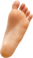
| 6 |
|
The current version of my logo. The nose has been restored and a beauty mark added to match my actual face. There's a highlight on the top of the head. The slight purple inner shadow has been made much more prominent compared to the previous versions to better imply depth. The sole of the foot is facing away rather towards the head and the fifth toe has returned. A little highlight has been added to the ball of the foot to match the one at the top of the head. The foot slightly overlaps Bluey's left ear, whereas previous versions avoided overlap; this leads to a slightly bizarre effect where it looks like the foot resembles a hand, but I'm not mad about it.There are actually two versions of this. In one version, the eyes are looking forwards toward the viewer, as in the previous versions; in the other version, the eyes are looking towards whatever is on the other side of his foot. |